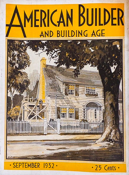
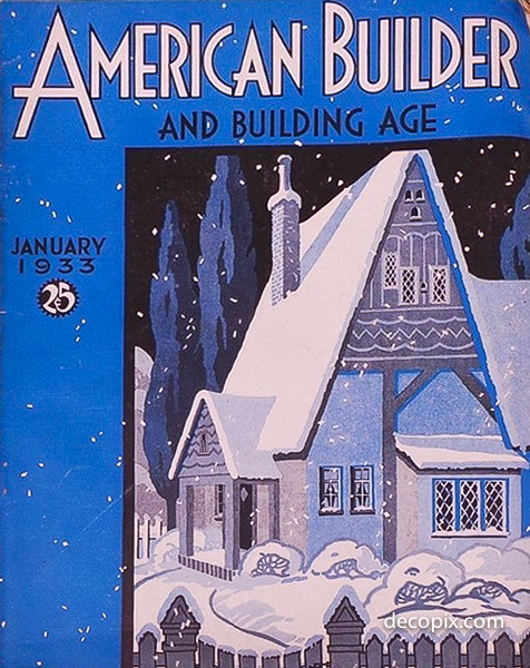
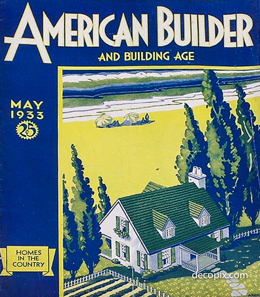
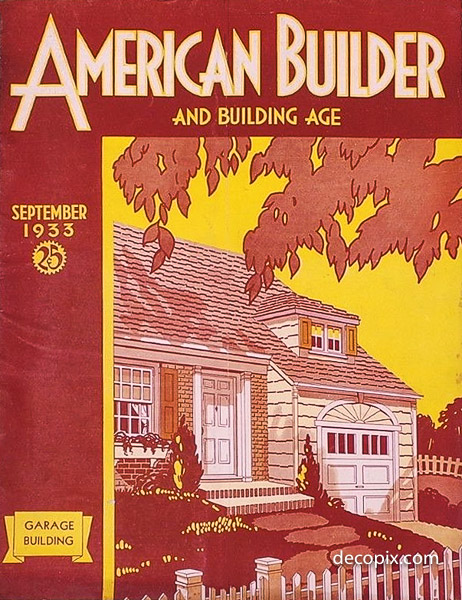
Having identified Chicago artist Lyton Erl Arent (1897-1970), I set about looking for more of his work and discovered he drew covers for American Builder magazine as early as 1932.
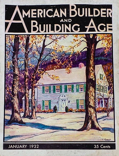
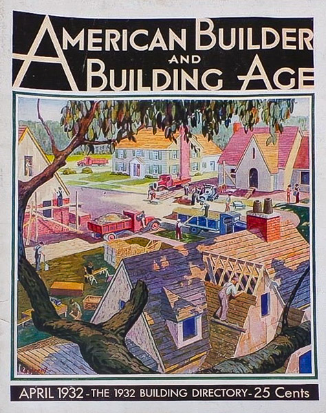
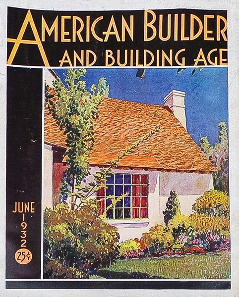
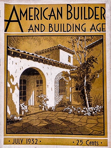
These earlier illustrations show his talents, but other than the magazine’s logo, there is little to suggest Mr. Arent had any inclination towards Art Deco or Streamline Moderne.
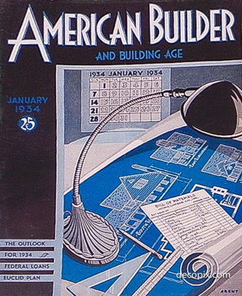
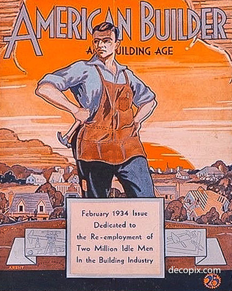
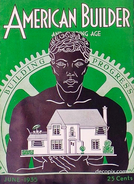
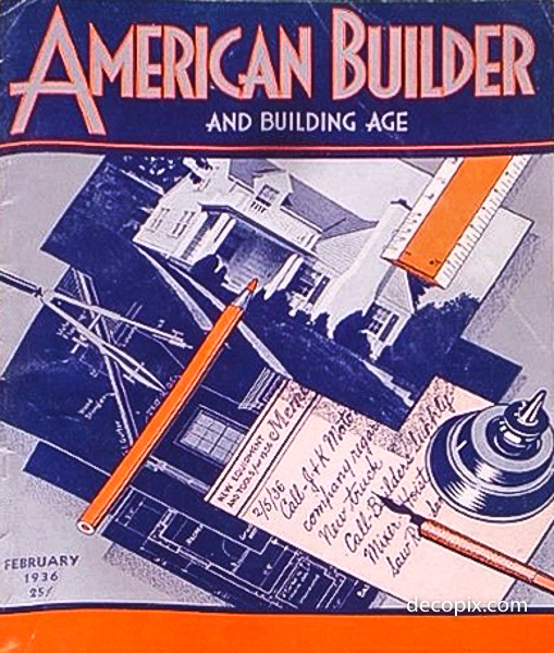
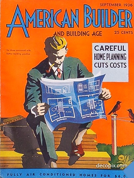
That all changed by 1934, and I can guess why: The Century of Progress. Living and working in Chicago, Arent would have been well aware of the event; in fact, he drew two Worlds Fair covers.
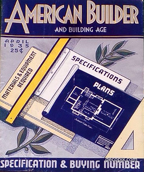
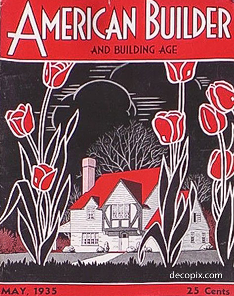
And it appears the fair made quite an impression, as we can see in the covers he produced from 1934, on.
1932
1933
1934
1935
1936
Having been very much interested in the content of these magazines over a period of several years, being actively studying architectural history of the period from the early 20s through the early 50s, I have collected quite a few of these particular issues. I wasn’t so much interested in the covers, as the articles contained therein. However, even though I was also drawn to the very unique artwork of those covers, I would have purchased them without covers, as long as the articles were in good condition.
However, since I still have every issue I purposely bought, (and a few I didn’t if they came along in lots with others I did want) I suppose what I’m most interested in at this moment is if they have any particular collector value regarding the cover art more so than the editorial content? I must admit I’m not too inclined to part with my collection at this point, but I might be interested in doing so if the value of their cover art significantly exceeds their general value for content. I didn’t purchase any that were significantly damaged, and paid a small premium for those in the best condition, given the choice of multiple issues of the same date.
I haven’t ever laid them all out side by side to compare artistic style. But having been made aware of the fact that such differing styles all came from the same artist, I must admit that the style differences certainly do carry along the changes in popular architectural designs compared to the changes in the historical context of the decade. Only natural I’m sure, but not so much that would have been obvious coming from the same artist.
Hi Shari – The softeware that runs this site seems to lose comments. I apologize for the delay. I’ll post your comment and let you know if someone responds expressing an interest.
Fabulously evocative covers, would love to see inside!
Thanks for your commennt. As with the pulp magazines of the era, the insides of these magazines are rather disappointing save for some bits that might be of historical interest. The major architectural publications like Architecture, Architectural Review and American Architect had some interesting ads (U.S. Steel had a series of drawings by Hugh Ferriss, for example) but there was very little color until the 1940s. There were many articles that described color schemes though, which seems sort of odd.
He actually began producing covers for the Simmons-Boardman group earlier, as he emerged from the Radford stable of artists. I have American Builder & Building Age magazine covers with decided Craftsman & Bungalow elements from 1931. Also — he was son of Michigan builder, and name was spelled Lynton Earl Becht Arent.
Fantastic artwork,
Kol
Thank you for this information!